How to Create the Right Logo
A company without a logo is like a person without a face.
David Airey, “Logo Design Love: A Guide to Creating Iconic Brand Identities”
Every business owner, sooner or later, must make a decision about their logo. It’s like the flag of your ship: even from afar, people should understand who you are and what you offer.
Clarity
If you are a small chain studio that has taken over a niche and become a recognizable brand, your logo must be clear. Anyone — from a student to a businesswoman — who happens to notice your logo should immediately understand: it’s a beauty salon. Don’t be surprised! It seems like simple advice, but everyone tries to avoid it.
Have you seen overly elaborate logos with a million tiny details that the eye can’t even latch onto? Be concise. I’m sure you can easily recall the Chanel logo. Use simple and clear minimalism in your logo — and it will be just as easy for your client to remember you.
Your Logo Should Reflect What You Do
Many people make the same big mistake. Unfortunately, creative and interesting names often don’t communicate anything to your target audience. The most beautiful and vibrant sign saying “Amélie” might just disappear into the background — people won’t connect it to your services.
If no one knows you yet and you’re new to the market, be sure to write in large letters: “Beauty Salon”. This way, you’ll secure strong visibility through outdoor advertising. And your beautiful logo can be placed right next to it.
Color Palette
Strangely enough, the color base of your logo allows the client to subconsciously draw a connection: “name = service”.
- What color comes to mind when you hear the word cosmetology? Soft, muted tones — light, beige, green, olive. Everything that evokes cleanliness and freshness. Psychologically, people perceive such colors as calming, friendly, and pleasant.
- Do you offer makeup services? That’s the complete opposite of cosmetology! You’ll want bright, bold colors — all shades of red. Makeup is strongly associated in the consumer’s mind with red lipstick.
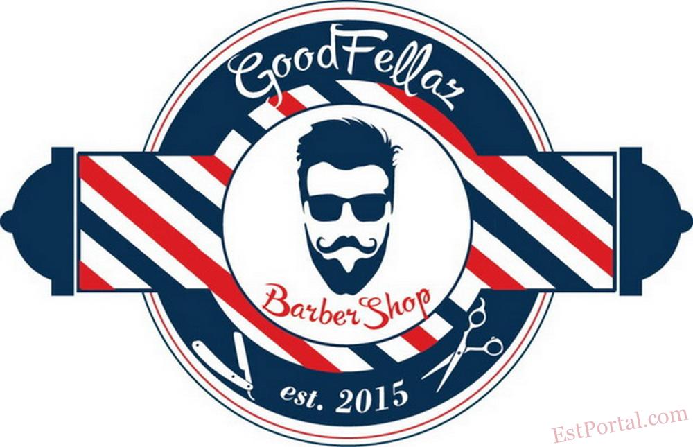
- Barbershops? Those are all the shades of masculinity: brown, black, dark gray. A bold, rugged palette full of strength and style.
- Beauty bars are little islands of beauty. In large shopping malls, they must compete with big-name brands and stand up to the biggest sharks in the business. Use memorable colors — turquoise, purple, magenta. Anything that can amaze, attract, or hook someone’s attention will benefit you and your brand recognition.
Concept
And the most important thing — as always — for dessert! Your logo should be inseparably tied to your salon’s overall concept. Later on, when you use it across all advertising platforms, it will communicate your idea and carry your salon’s identity out into the world. There should be no disconnect — where a customer sees one thing in your ads and encounters something entirely different in person. They’ll feel misled.
You know, many business owners don’t see the point in spending time or money on a logo. Why bother, if I can just find an app online and sketch something together for free?.. And then come the questions: “Why isn’t my advertising working? Where are the clients? What’s going wrong?”
Work through every detail of your salon. It should all function properly! And your logo — that’s the foundation. The place where your business begins.
Olga MART — beauty business expert, founder of IQ-Project


